This Book is Actual Size
Katie Schwab's Sample Book. Bleet! by Sargent, Cohen and Harry. Sara Nicholson at the Frick. Anni's repetition repetition. Mor Demer. Kenneth Clark's 100 details.
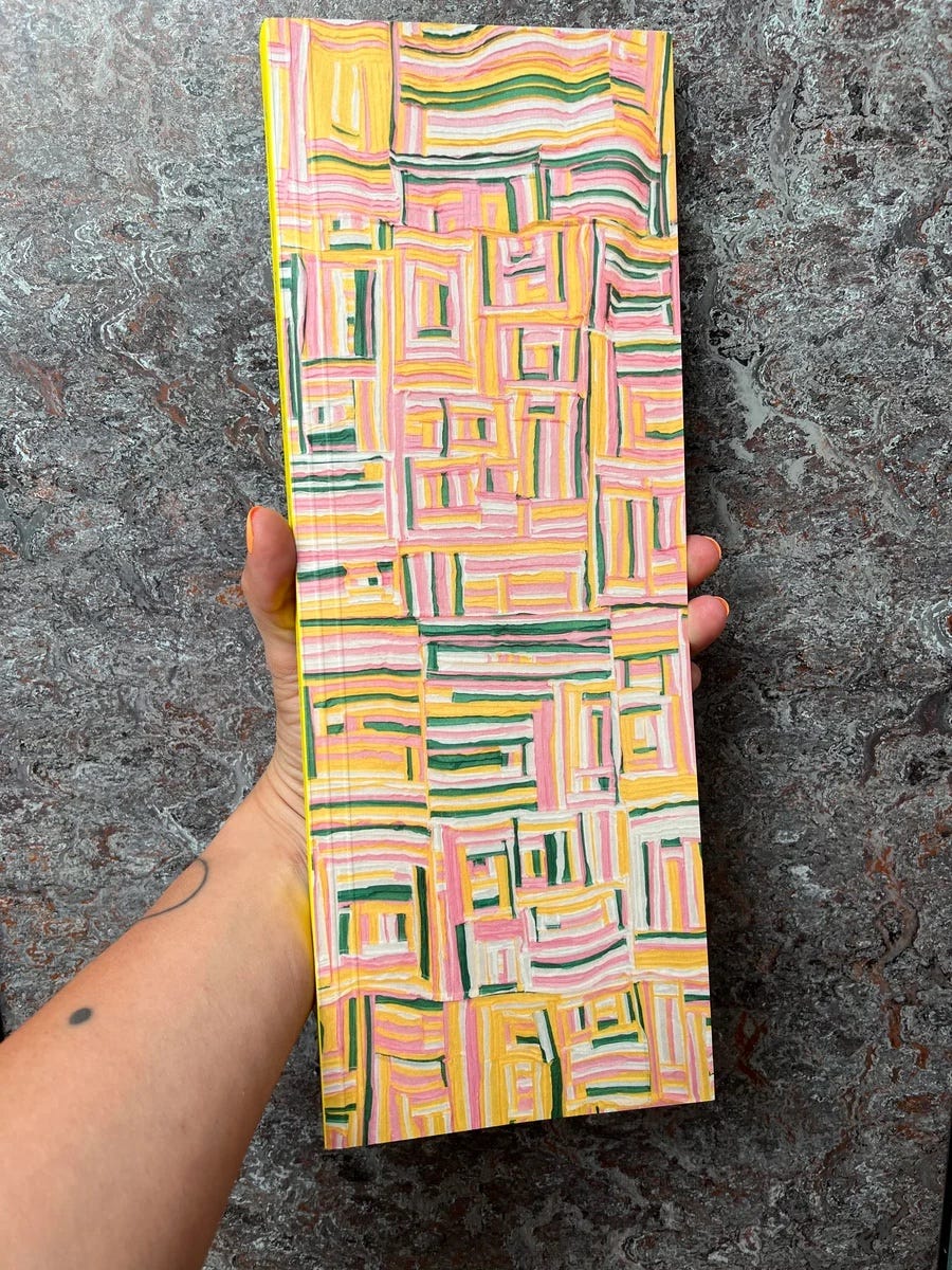
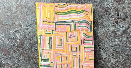
Hugo Pictor had a dream in which all his books became much narrower and three foot tall. When he woke alarmed and headed towards the book pile the first volume he encountered was Sample Book, the long narrow, monograph of the artist Katie Schwab. Hugo Pictor picked it up like a Gilgamesh tablet (in both hands), opened its long pages, unfurled from its insides a yellow, metre-long, ribbon.
Hugo Pictor’s practicality leapt into action. What are you for? he asked the yellow ribbon, before looping it carefully around an exhibition brochure for Schwab’s show at the Vleeshal Centre for Contemporary Art in Middelburg, to bind it into the whole.
Behind Schwab’s monograph was the first three publications in the series Bleet! by Ben Sargent, Sarah Cohen, and Alice Harry. These, too, were narrow and three inches longer still. A largely blank front page had the imprint logo added as a sticker, plus a small drawing of a goat. This left the opened out insides and back cover as the space for an artist-writer, with a small folded over strip serving as an improvised spine.
Sargent’s Working Hard, Hardly Working offers a non-linear constellation of paragraphs to chronicle and reflect upon experiences of working in a supermarket, the acts of defiance that are possible (‘We used to throw cake onto a two-story high ledge while the customers weren’t looking to see who could get it to stick’). Sargent draws on utopian concepts of ‘play’ and ‘labour’ in art projects by Allan Kaprow and Celine Condorelli, whilst also doubtful about just how transformative such acts of rebellion can be. Sargent quotes the artist Emily Pope noting that she stole time for her own writing whilst working a ‘shitty misogynistic job’ but that ‘she probably should have just told her boss to fuck off’. The orange typeface seems to demonstrate this, as it makes the text both more vivid and on the edge of vanishing.
Sarah Cohen’s I want to be (outside of your cuticles) is described on the publisher’s website as a ‘guilty confession to the ghost’s in Sarah’s life’ and ‘AI used as a medium to speak to her dead’. Printed over a haunting, indistinct photo of some kind of celebratory group, the text loops, repeats, samples itself, perhaps stumbles around the address and the event it wants to account for. It certainly uses the format and the specifics of riso print to suggest a murky mystery of image and text together.
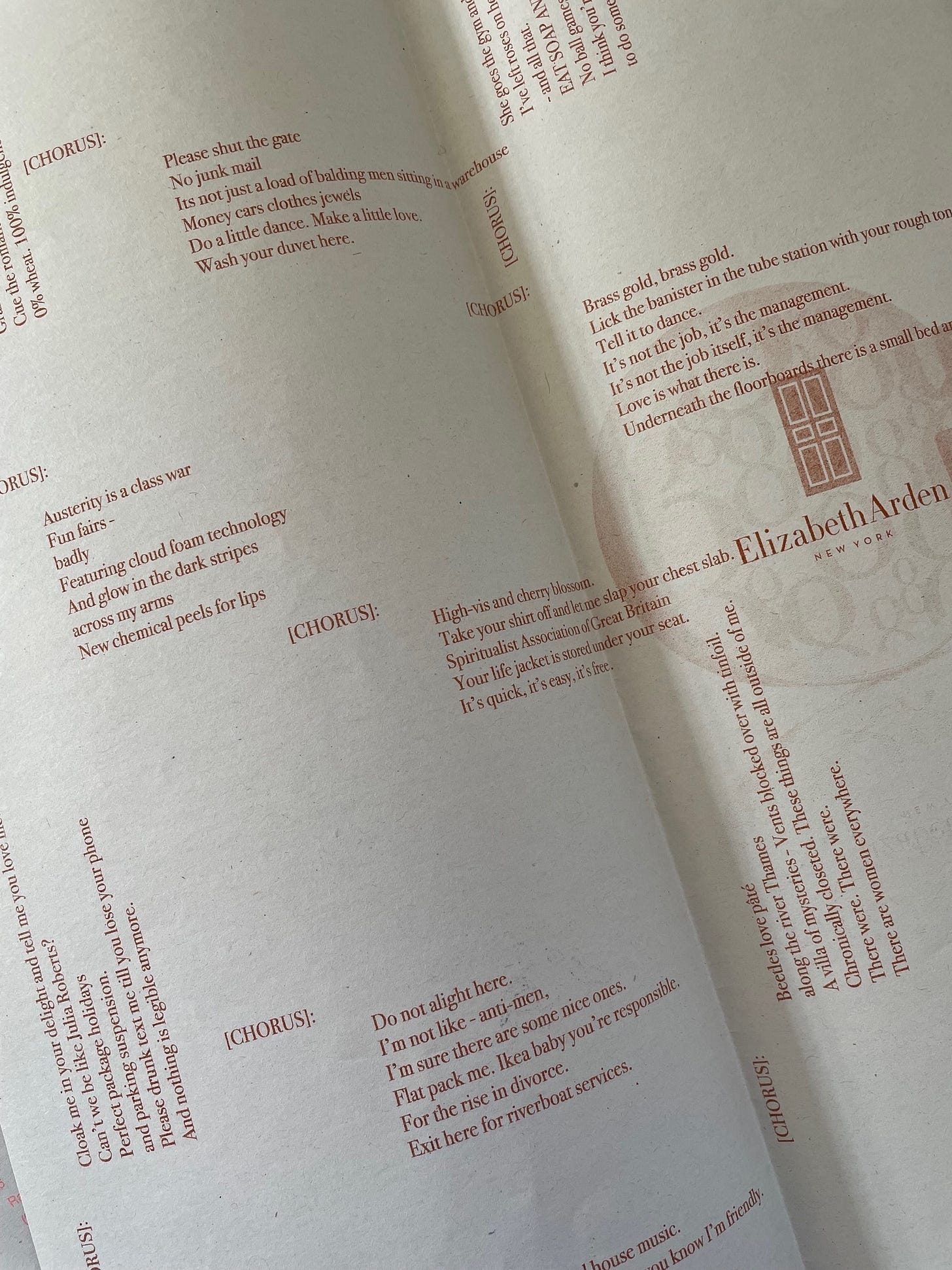
The photo above shows the elements comprising Alice Harry’s Accession through the Care of Skin - {skincare}. Each chorus offers a semi-random assemblage of fragments plucked from a cultural whirlpool, shaped into the formal refrain of the chorus, its promises of repetition, infectious catchiness, rhythmic fulfilment (but were any of these ever repeated again?). Bleet!’s come delivered in a very long envelope.
Back with the Schwab, Sample Book is a standalone publication alongside small wares, the artist’s 2021 exhibition. It chronicles the artist’s engagement with the Middelburg Darning sampler, a local 18th century form in which a series of colourful grids and patterns appeared across a sheet of linen, as students practiced different darning stitches, then sewed too the name, date, location and initials of their teacher.
The book’s own abundance of forms includes essay, fictocriticism, interview, and a shape poem by m.patchwork monoceros, its lines curving across the page to recall both that yellow thread, and the thin, woven strip that journeyed and suspended itself around the Vleeshal in Schwab’s final installation. Hugo Pictor returned to his illuminating-desk rich with sensations of connection, binding, weaving….
Then Hugo Pictor remembered his dream of the long, narrow books, turned back to the book pile, wondering what volumetric nocturnal disruptions would greet him.
Where does the narrow, elongated form originate? Schwab notes her books indebtedness to a 1972 Musée des Arts Décoratif, Paris catalogue for the exhibition Des dorelotiers aux passementiers. Hugo Pictor went into the book pile to find the long, narrow poetic trilogy by the American poet Frank Samperi: The Prefiguration, Quadrifarium and Lumen Gloriae, published by the short-lived but rather spectacular Japanese-New York publishing collaboration of Mushinsha and Grossman, whose other masterpiece was the 1969 Frogs & Others by Kusano Shimpei translated by Cid Corman, and whose jubilantly croaking frog chorus were always at Hugo Pictor’s door.
More on that later. Long narrow books do not necessarily have to contain long narrow poems, but Samperi’s often are (the online PDF loses the narrow page format). The best description of how such forms can work is by fellow poet John Taggart, in his essay on Samperi in Songs of Degrees: Essays on Contemporary Poetry and Poetics:
The imagery of these poems is constructed by linear culmination - “dripping words,” in Zukofsky’s phrase. They read as severe catalogues of particulars, each line a single separate word or brief phrase. Occasionally, a stripped-down subject-word-object word order is retained as a sentence spine. This depositing of isolates in series of isolates produces a formal structure that is sculptural in its vertical severity. Without the delay of horizontal rhythms and syntax, the reader is drawn down through the poem with ever-increasing speed as if subject to some absolute gravitational effect upon the mind and eye, a sensation reinforced by the trilogy’s unusually long and narrow page size (10⅛” x 5¼”).Thus the image coheres only at (or after) the poem’s close. It becomes an image by virtue of the participating reader who puts it together as a glance configures a rose window. Hugo Pictor scoured the book pile for further instances. Maybe a lost Dimitri Prigov monograph? Maybe a lo-fi zine produced by a foot soldier from the Bayeux Tapestry, the pages cut to fit his one elongated shadow? Hugo Pictor was in the fantasy book pile now and there was no telling if he would find a way out.
When Hugo Pictor did re-appear, he was holding a copy of April, a 2023 collection of poems by Sara Nicholson, published by The Song Cave, whose standard format tends to the short and square-ish rather than the long and undoubtedly narrow. Hugo Pictor was soon reading, ‘The Goatherd and the Saint’, a nine page poem based around the poet’s visit to the Frick Museum in New York.
It had a narrow format although it wove different rhythms to the Samperi in its play of line breaks, syntax and downward gravitational pull. Here, format repeats that tension in the experience the poem is narrating: of looking at the paintings, the body practices of wandering in a gallery, responding to a visual medium in language. As Nicholson said in an interview with Zach Savich in The Cleveland Review of Books:
Poetry, unlike visual art, is temporal. You can’t take it all in at once, it has to unfold rhythmically in time. (I know there are exceptions but I’m happy to ignore them, for now.) Prosody divides a poem into durational units—the line, the foot, the beat—creates patterns in time.Long-looking at paintings probably removes this difference, pondered Hugo Pictor, but he saw why Nicholson said it. The poem itself moved, like a visitor to the gallery, from Rembrandt to Fragonard to Boucher, but mainly settled on Bellini’s St. Francis in the Desert. For the moment, Hugo Pictor had only a scattered series of notes:
A ‘lack of context’ ‘adds/ Narrative to/The phenomenal/ details’. Imagine yourself inside a Fragonnard. Frick’s St. Francis in the desert amongst the Frick mansions neo-Baroque interiors of objets d’art. Frick himself: lover of art, enemy of labour. $22 admission. If you study anatomy as well as poetry, she says, love’s seat is the lymph not the heart. Nicholson ‘loves’ the donkey in the painting, attention chooses landscape over Saint. She wonders how each detail fits in Bellini’s symbolic universe. Her own, the poem. Being embedded (the poem) ends with more details I won’t detail. Details of what, really? Hugo Pictor never wrote poems about such experiences.
Back to format: would such long, thin poems be better on a long scroll. Hugo Pictor didn’t think so. The page and the square-ish book enacted an interruption, a hesitation, a shift like going to the next gallery, the bookshop, and the bathroom. The partiality, frustration, curtailment of looking at Bellini, Rembrandt ,whatever. Outside-
Where to go now? Hugo Pictor was looking at photo’s of Carolee Schneeman’s Interior Scroll. He was looking through repetition, repetition, a compendium by Anni’s (moniker for Copenhagen based graphic designer Anni Vestergaard). It featured a gathering of images (from other books) of grids and systems, in the tradition of books on hives, labyrinths and bread which were amongst Hugo Pictor’s recent favourites.
What distinguished Anni’s book was that featured pages had been fitted into her own book, on a scale of I:I, aligned at the bottom right hand corner. This had the strange effect that, depending on the original page layout, the image that had attracted attention might not feature, or might feature only partially, or there might be the caption only, or the caption for something else, or another image altogether.
What was the effect of this? In one sense, it made the publication what it was: a graphic designer thinking through the possibilities and paradigms of their design practice. Whilst the collection presumably exists un-edited in a folder or on a computer file, the publication is achieved through certain constraints, choices, and distortions, like any graphic design commission.
Hugo Pictor found it a curiously sombre reflection upon the editor-author-designer’s own practice. All the images get catalogued in an index, fulfilling an archival function, with the book a singular take or movement rather than a full, fixed repetition.
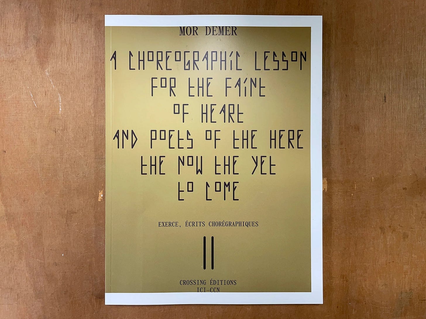
As he pondered this Hugo Pictor turned briefly to Mor Demer’s A choreographic lesson for the faint of Heart and poets of the here the now the yet to come.
Notebooks, essays, programme notes, photos, diagrams, all become held within the large page size of an orchestral score, often with the purple border seen above. Book within book, it is describer and instigator of a body and movement. Which seemed a literal way of bringing all the stages of a creative process together, the book and its reading as a way to shake up the tenses through the offer of something a bit unwieldy.
Finally, still thinking about format, Hugo Pictor plucked from the book pile One Hundred Pictures from the National Gallery. The book is still available in the National Gallery shop today, but with a radically different format and idea of art historical encounter to the first edition of 1938, with notes and introduction by Kenneth Clark.
The original edition was a large 13x11. Aside from the introduction and notes it was composed entirely of black and white full page plates, of details from paintings in the National Gallery collection. In a move that would have appealed to the compiler of repetition, repetition, the format sought to reproduce the details at actual size.
Importantly, there was no reproduction of the whole paintings from which the details were taken. I wondered if the book’s size prohibited its use in the gallery itself, or whether it could be used like a large board on which someone pinned a sheet of drawing paper whilst copying.
Clark’s notes spoke of using the photographic details as an aid ‘to look at pictures more attentively, and show us some of the rewards of patient scrutiny.’ He enjoyed details which upended expectations about artists, styles and traditions. A detail from Pollaiuolo’s Martyrdom of St.Sebastian revealed a landscape equal to Château de Steen by Rubens. A row of miniature trees enables a detailed consideration of Hobbema’s The Avenue at Middelharnis separate from the all dominant perspective of the receding lane.
In the notes, Clark informs, gossips, details, settles a few attributional scores, and generally keeps a tone of ‘the kind of conversation which two people fond of painting might have while going round the National Gallery.’ One Hundred Details captures the tension in Clark between the brilliant art historian and the popular explainer; the broad sweep required by television, as demonstrated in his own Civilisation series of 1969, and the implications Clark discerned in the method of Aby Warburg. One Hundred Details is a popular, introductory version of Warburg’s Mnemosyne Atlas in both its sense of iconography, and its use of black and white photography.
Take it further, thought Hugo Pictor. In a Rubens detail there is an Andy Warhol screen print of Elizabeth Taylor, in the rear of a Crivelli some landscape by Paul Nash…. Hugo Pictor was exaggerating as normal but that was the general implication, so concepts of time, history, and style swirled him vertiginously out into Trafalgar Square.
The book has been reprinted in numerous editions, usually with introductions by the latest National Gallery director. As soon as cheap printing allowed, the book shrunk down in size, acquired colour plates, and displayed the details in relation to the whole painting. Which removed a whole method of looking and thinking and considering. For the gallery’s 200th birthday, there may be a battered 1938 edition in a secondhand bookshop bargain basement. Hugo Pictor knows what he would do with such treasure, but he’ll be holding it up over his face so you probably won’t recognise him.
